The Comprehensive Design Project
represents a larger scale project proposed
by BA ( Hons ) Architecture Degree,
which aims to challenge the students
and help them better understand the
applicability of the learned knowledge
as well as a variety of visual
representations. The Design Project
contains the research of different subjects
in the domain of Architecture. It's main purpose is to
evaluate the understanding of architecture
and creative skills.
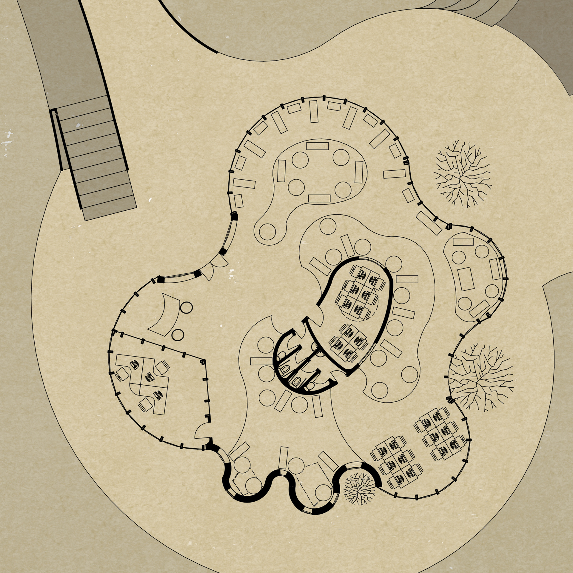
MAIN BUILDING GROUND FLOOR PLAN
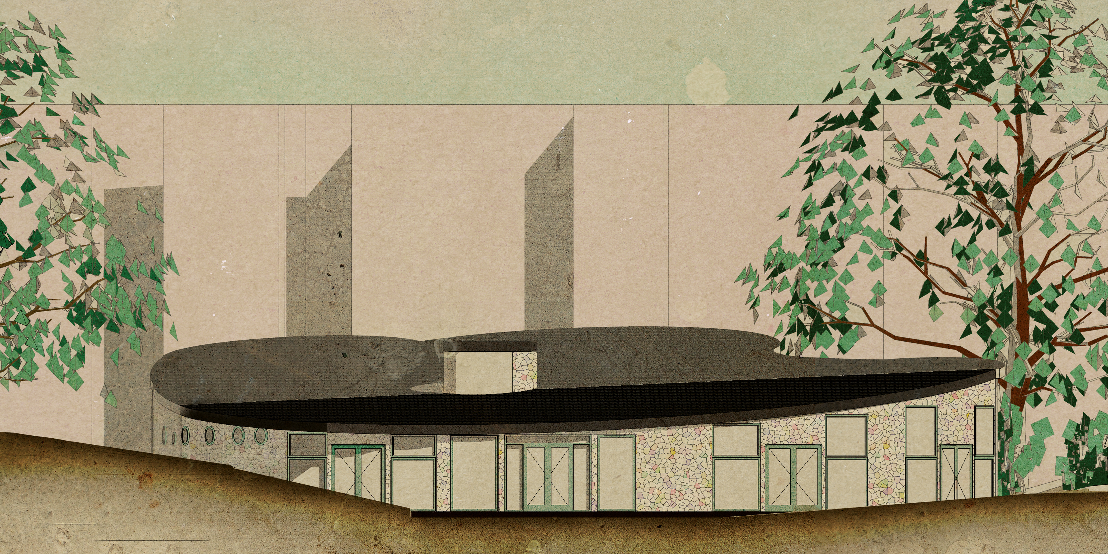
The main building design follows an organic shape, mainly inspired by Thomas
Church’s surreal landscapes. The organic forms seen in Dewey Donnell Garden
landscape influenced the design of the community center landscape, as well. The
building describes a flowing shape, which creates more natural-like spaces.
The design aims to use curves to create a space that would offer people a complete
experience. The fluid shape creates a welcoming and harmonious space.
The lack of squared angles help people feel more secure and free at the same time,
as there are no straight walls to obstruct their path around the building.
The entrance comes straight into the reception area. From here, people can access:
children’s play rooms, the conference room, the gallery and administration
offices. Apart from these spaces, there are a few relaxing seating areas for reading,
studying and socializing.
The first floor provides even more public spaces, where people can sit, admire the
view and relax. Moreover, there are three artist studios, fully-equipped with tools,
paints and brushes and a meditation room that can also be booked for different classes,
such as dancing, ballet etc.
Each studio has an exit to the lake and the outside seating areas. There is also the
possibility to exit the building from the main hallway.
MAIN BUILDING FIRST FLOOR PLAN
Informed by the Media Library (France), the main
building’s design resumes to a flowing bright space. There’s
a subtle guidance in the organic shape of the building, each
curve draws the eyes to new views or spaces. The design’s
main purpose was to give people a sense of freedom, there
are no squared angles to stop their path. It feels like a never-
ending corridor, which opens up more and more spaces
for people to explore.
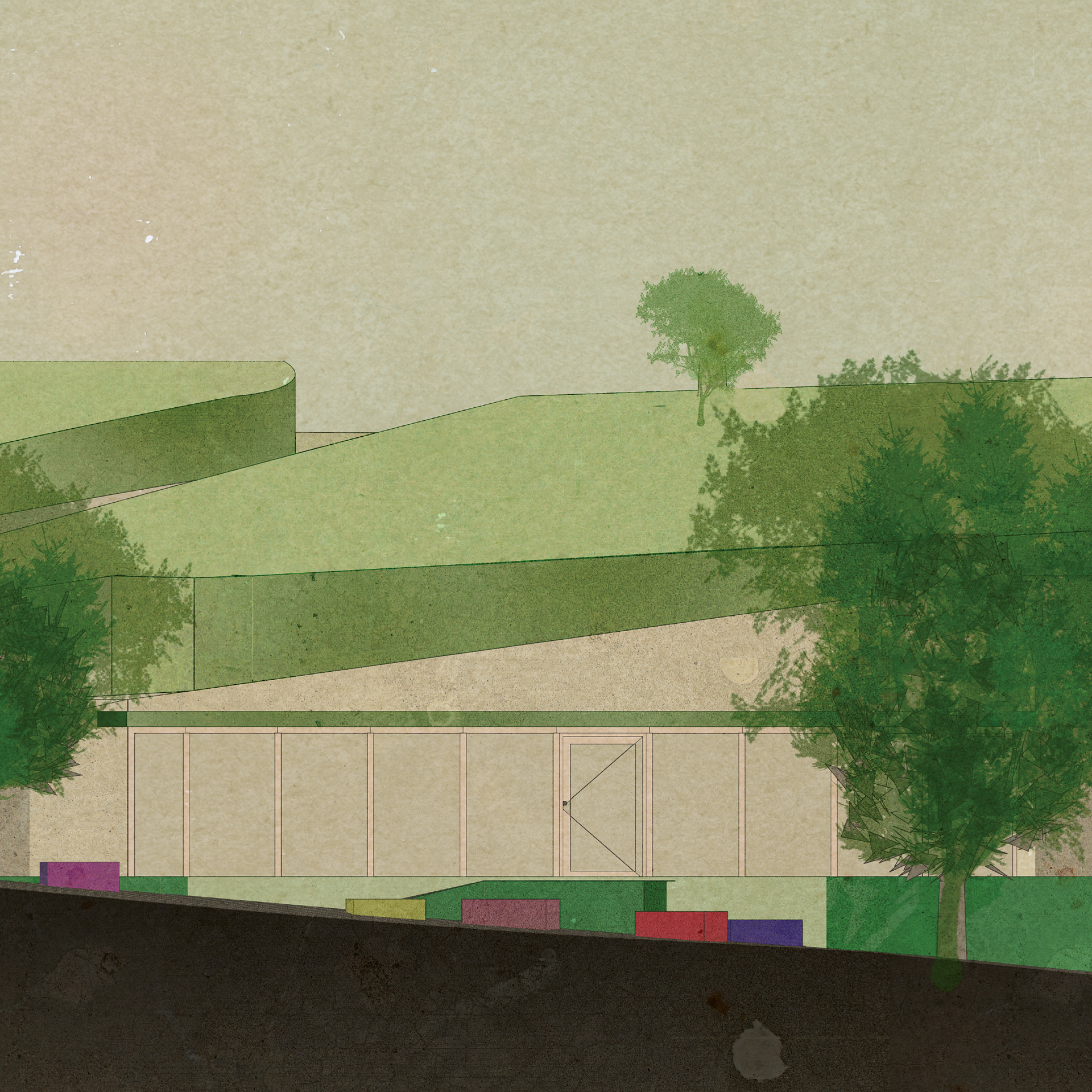
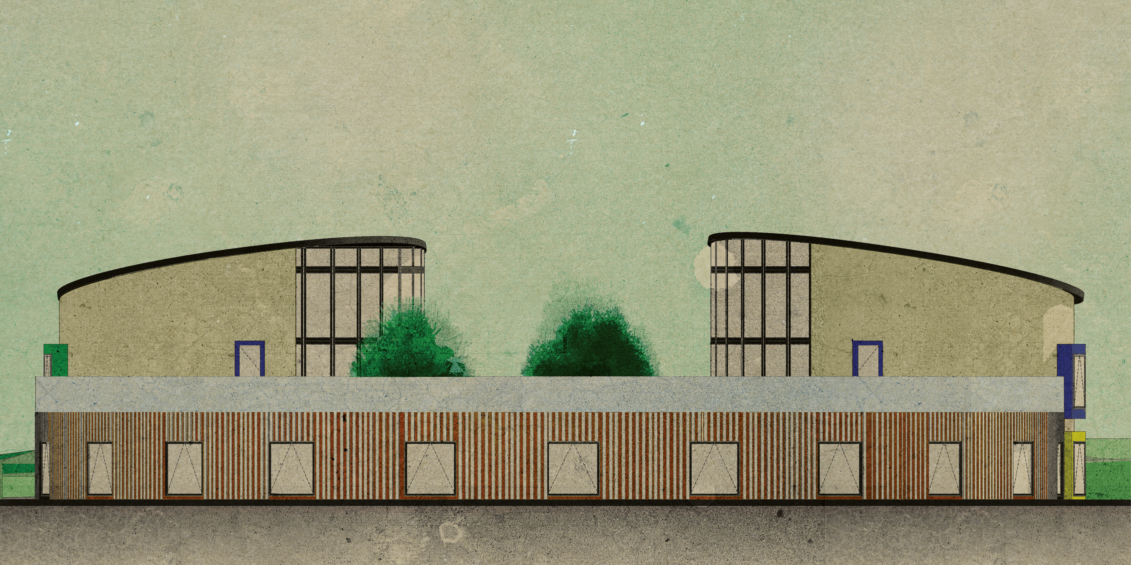
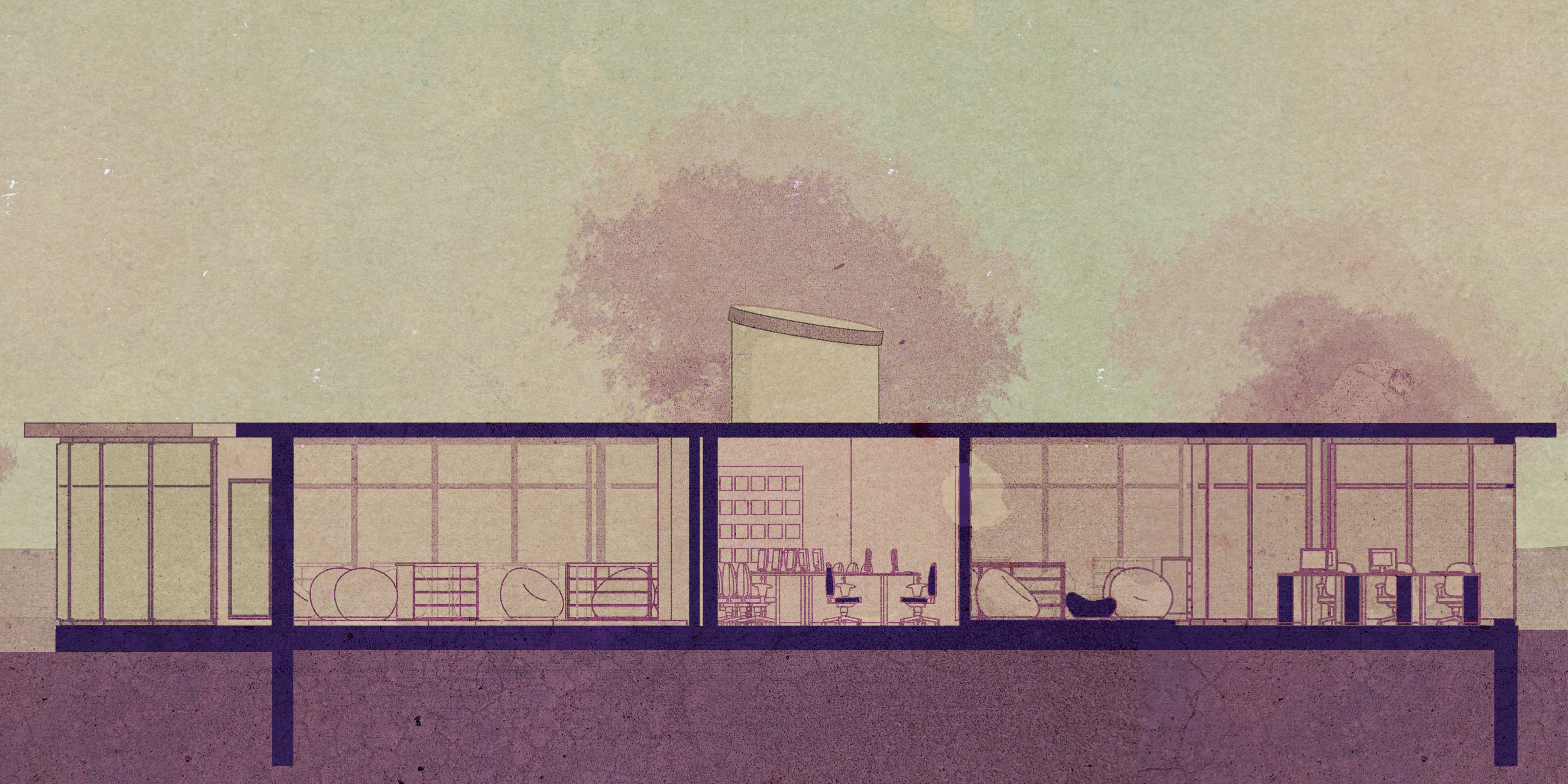
MAIN BUILDING FRONT ELEVATION
MAIN BUILDING REAR ELEVATION
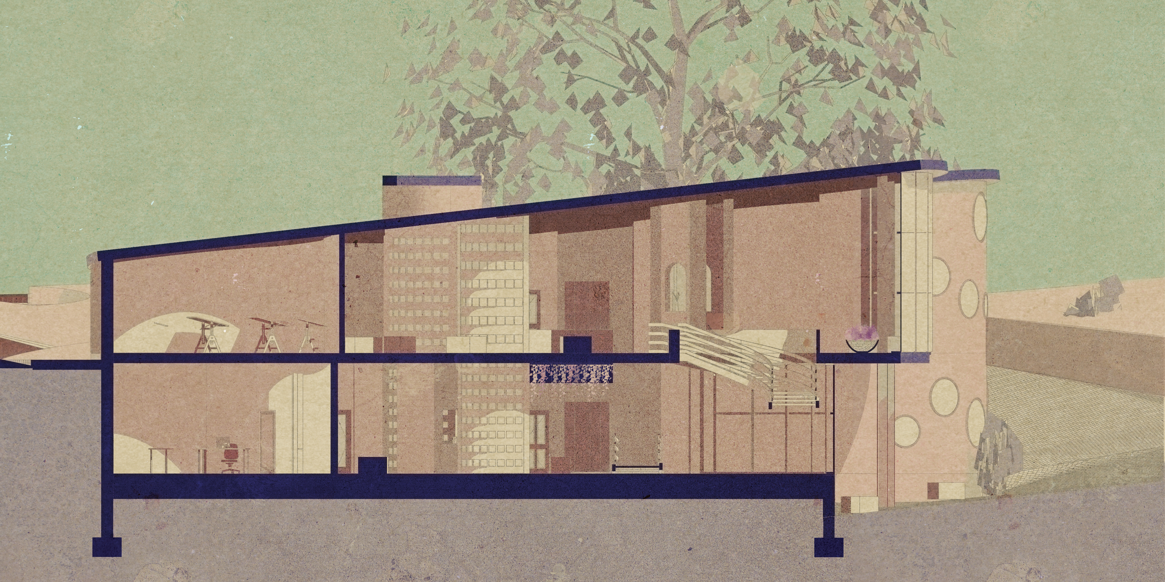
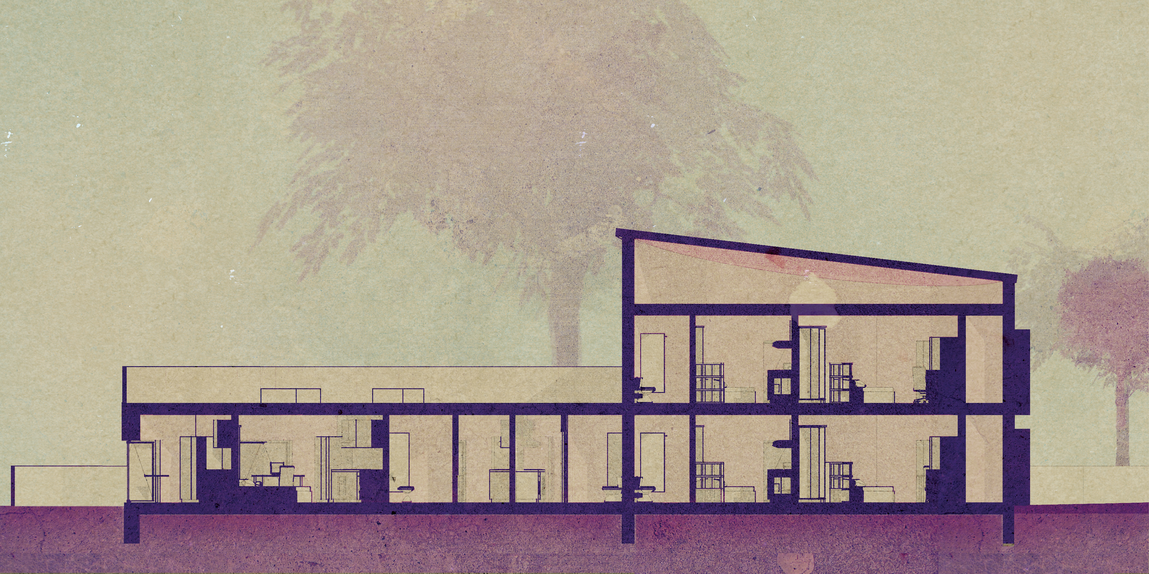
MAIN BUILDING SECTION
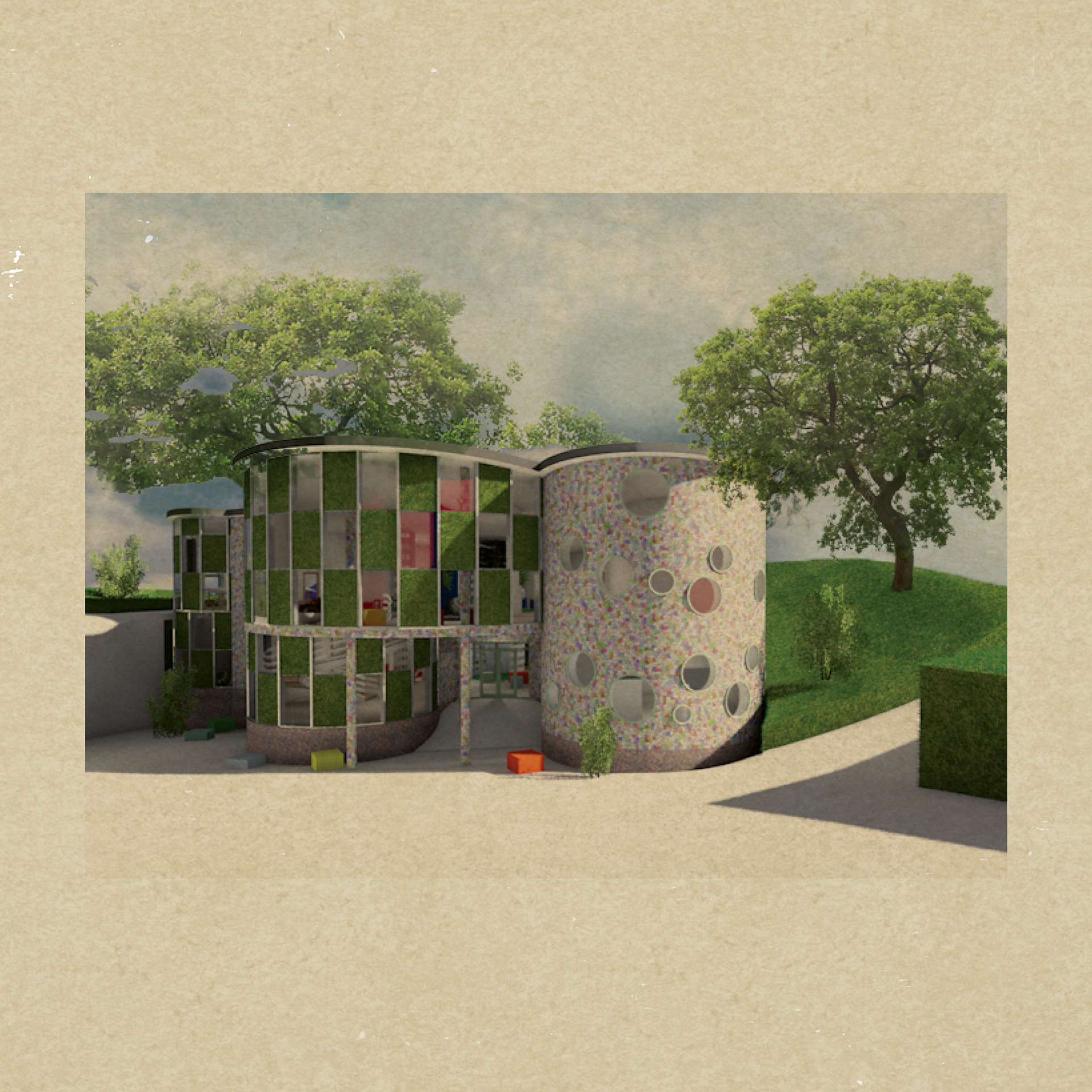
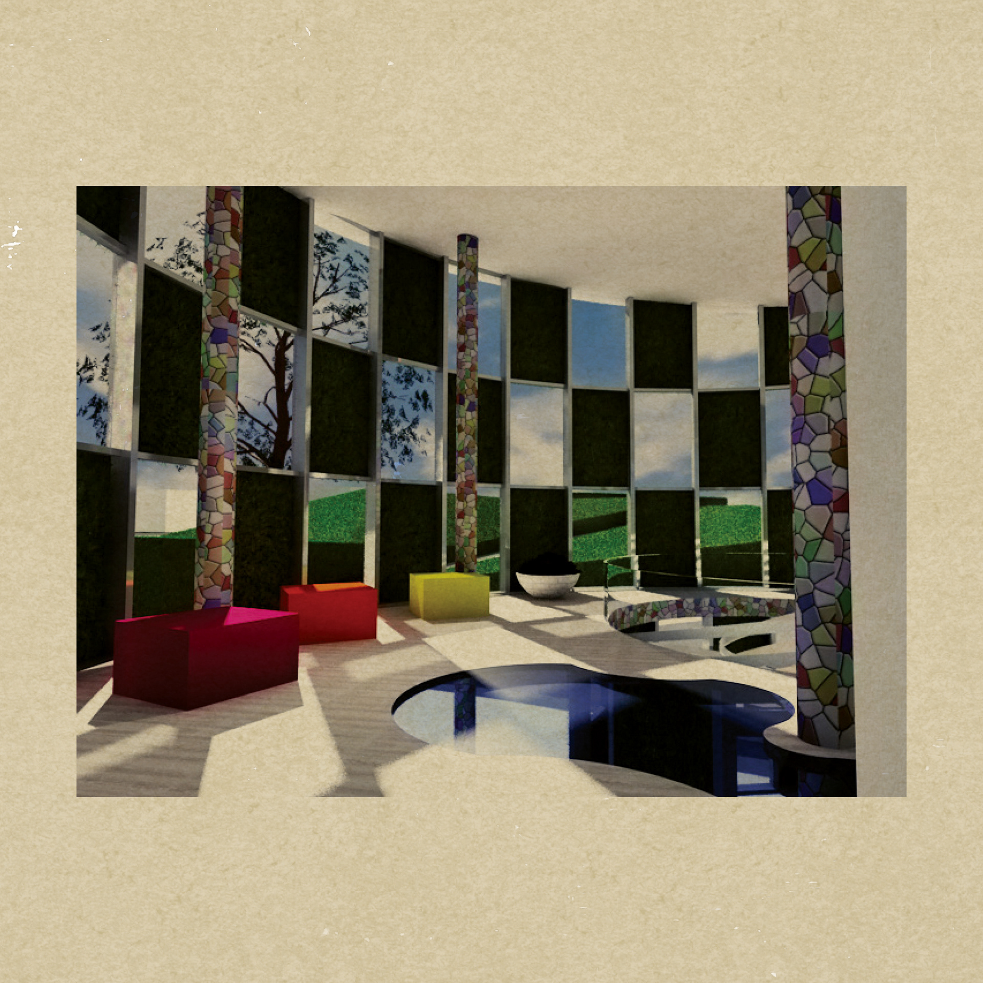
MAIN BUILDING ENTRANCE
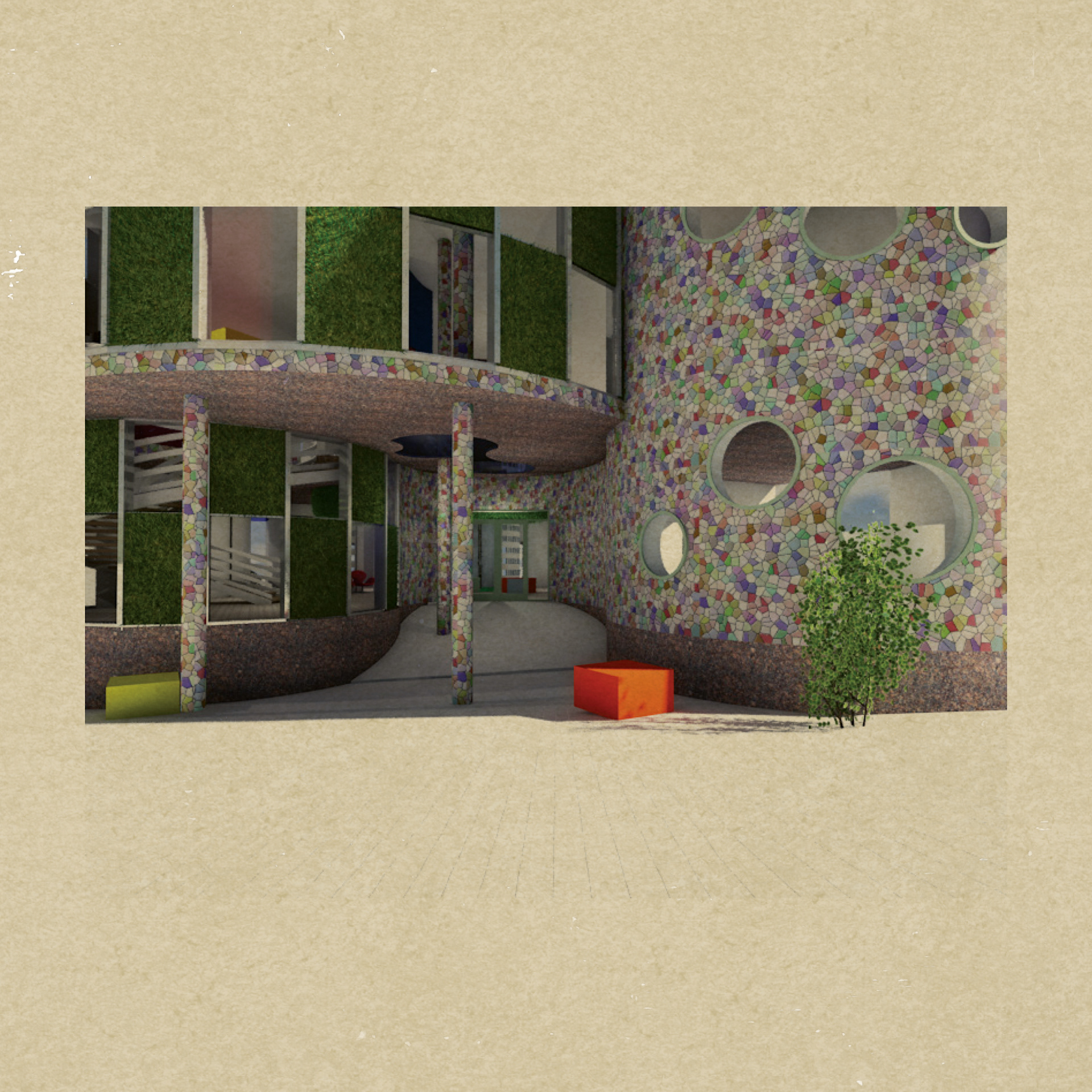
MAIN BUILDING ENTRANCE
MAIN BUILDING SEATING AREA FIRST FLOOR
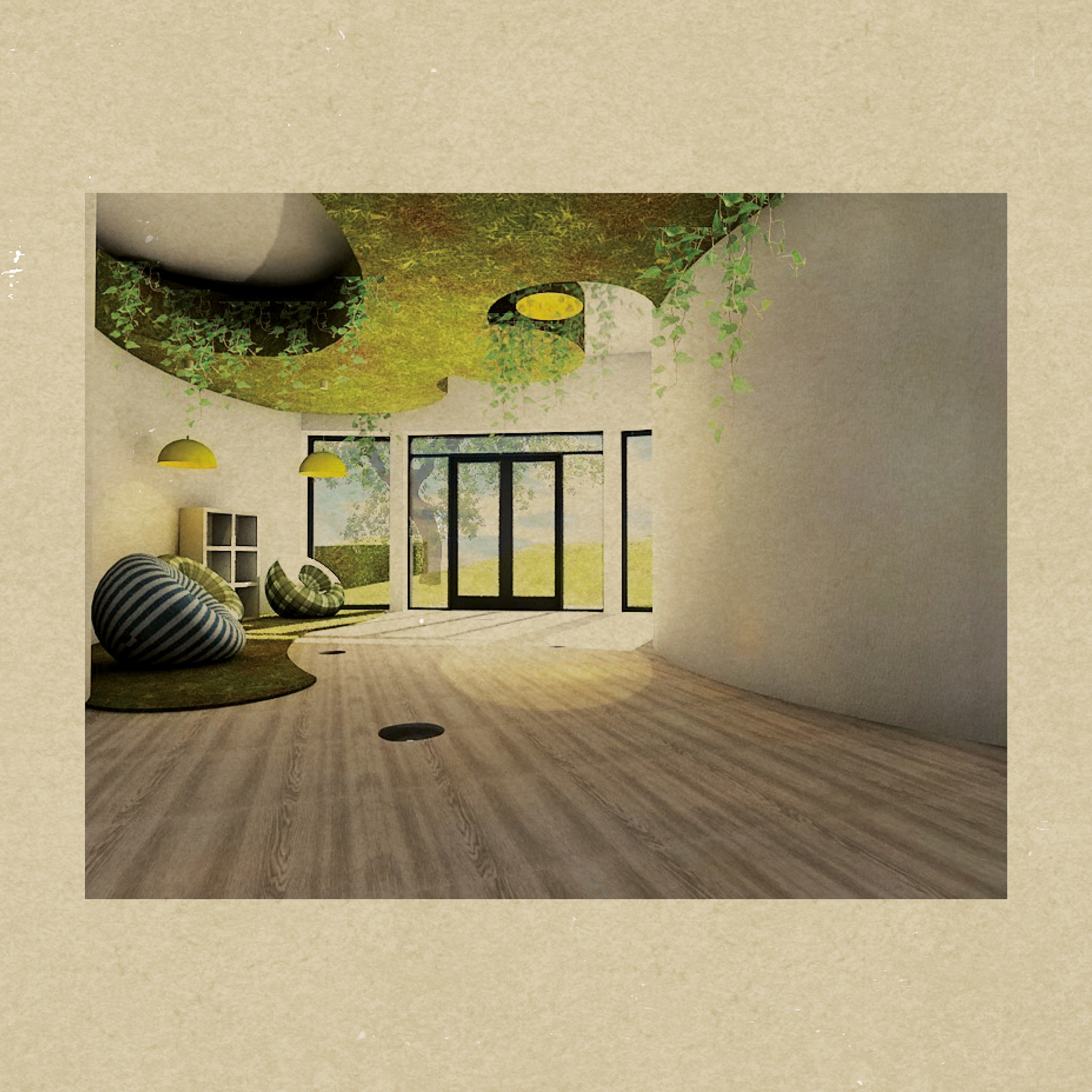
MAIN BUILDING AREA FIRST FLOOR
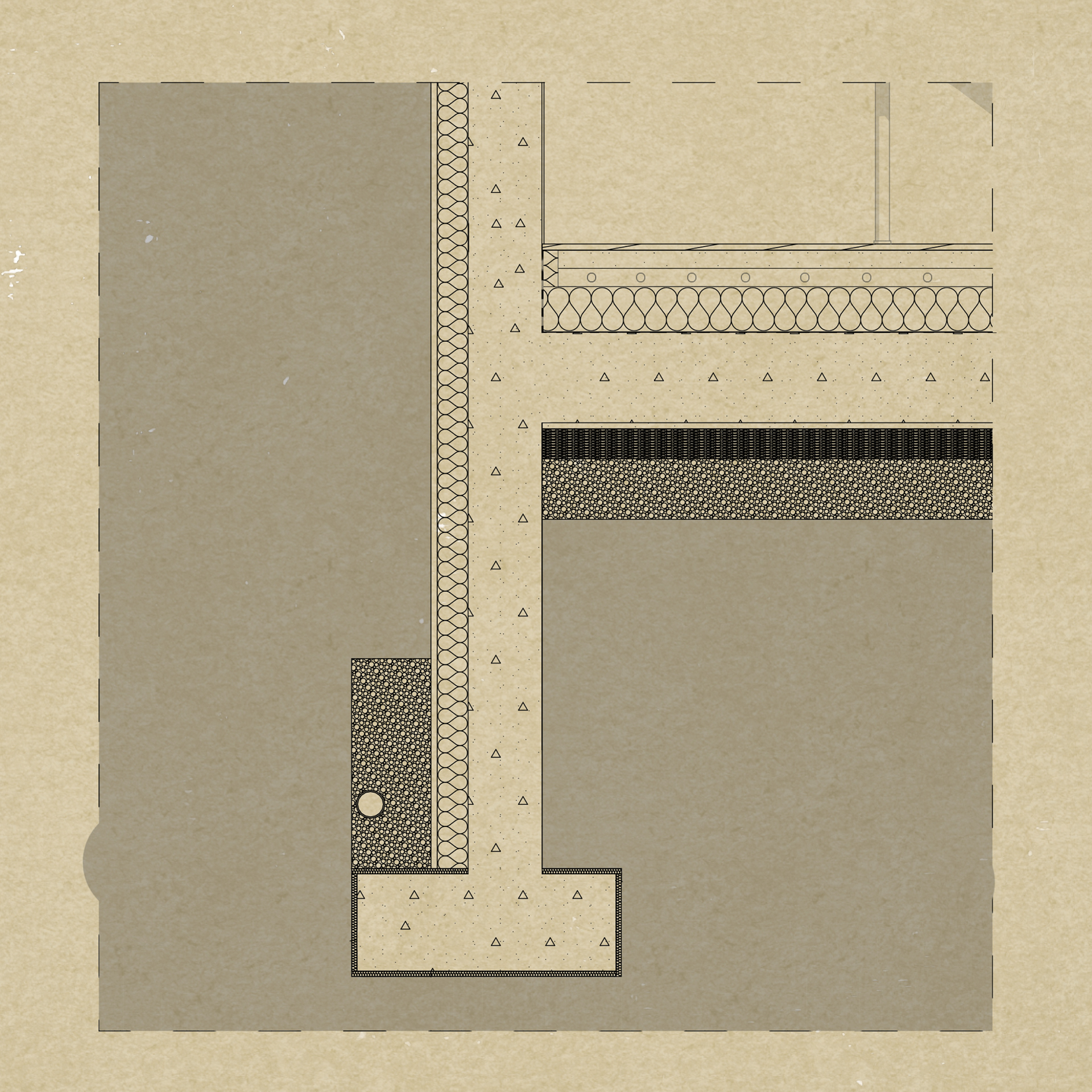
MAIN BUILDING STRUCTURAL SECTION FOUNDATIONS
MAIN BUILDING STRUCTURAL SECTION ROOF
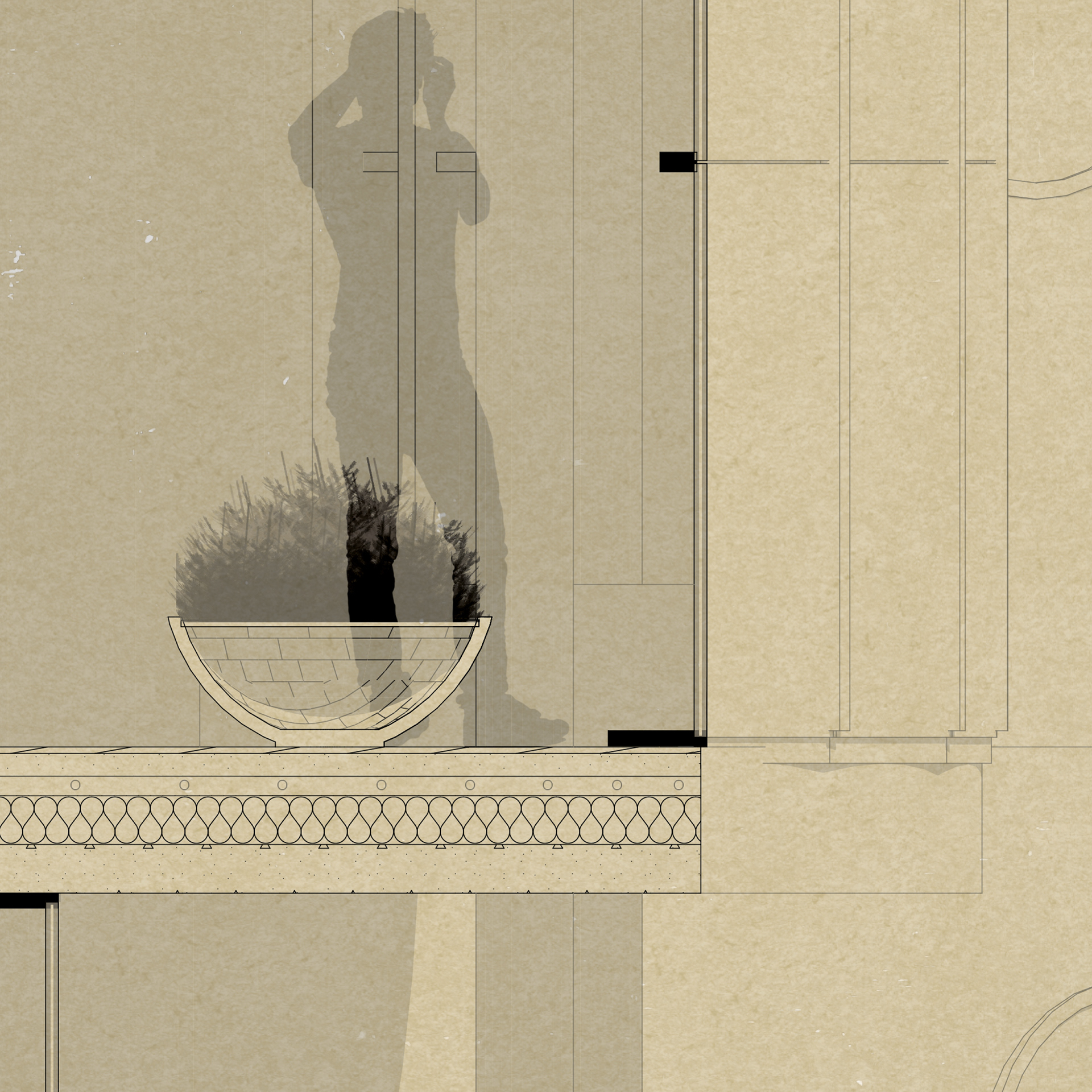
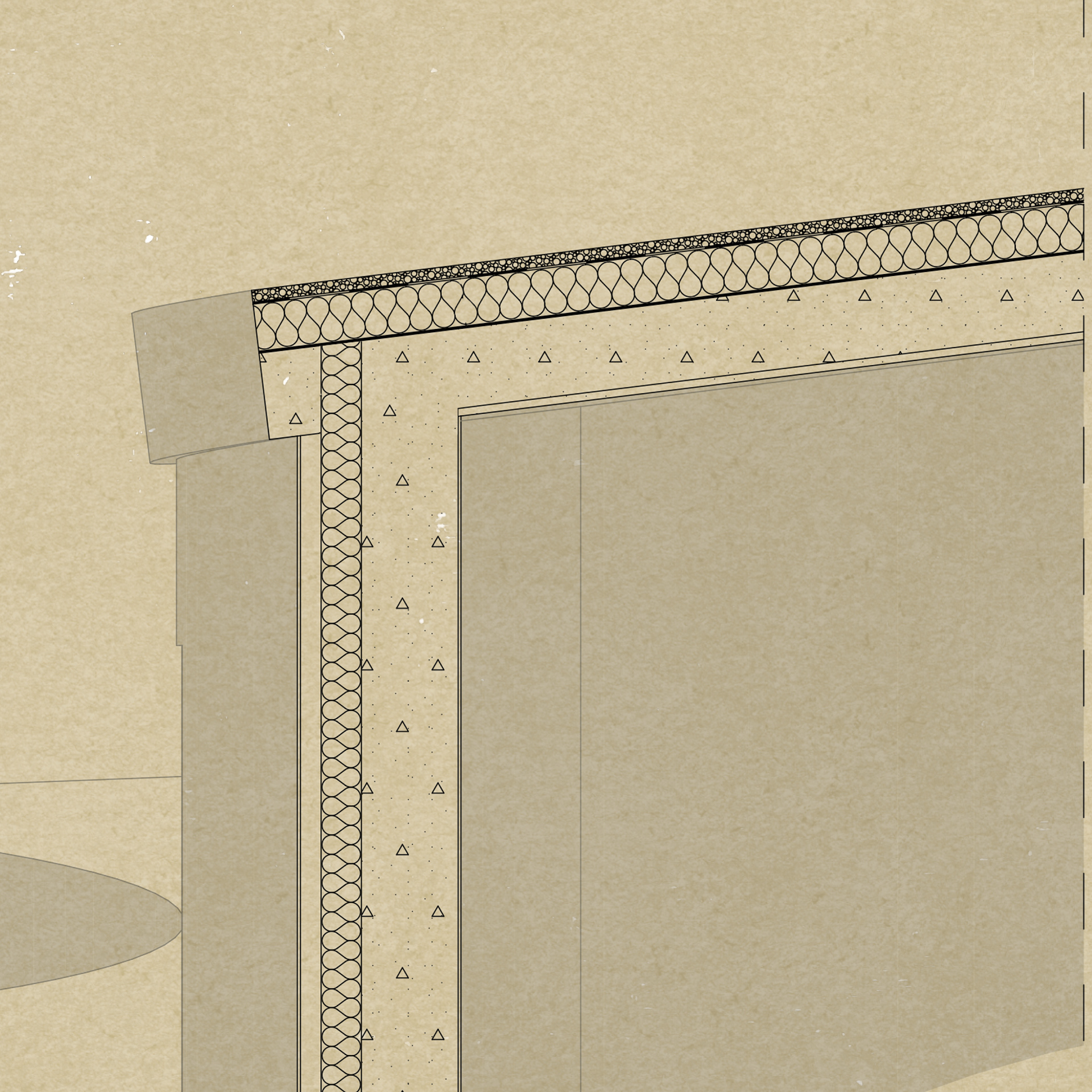
MAIN BUILDING STRUCTURAL SECTION WINDOW

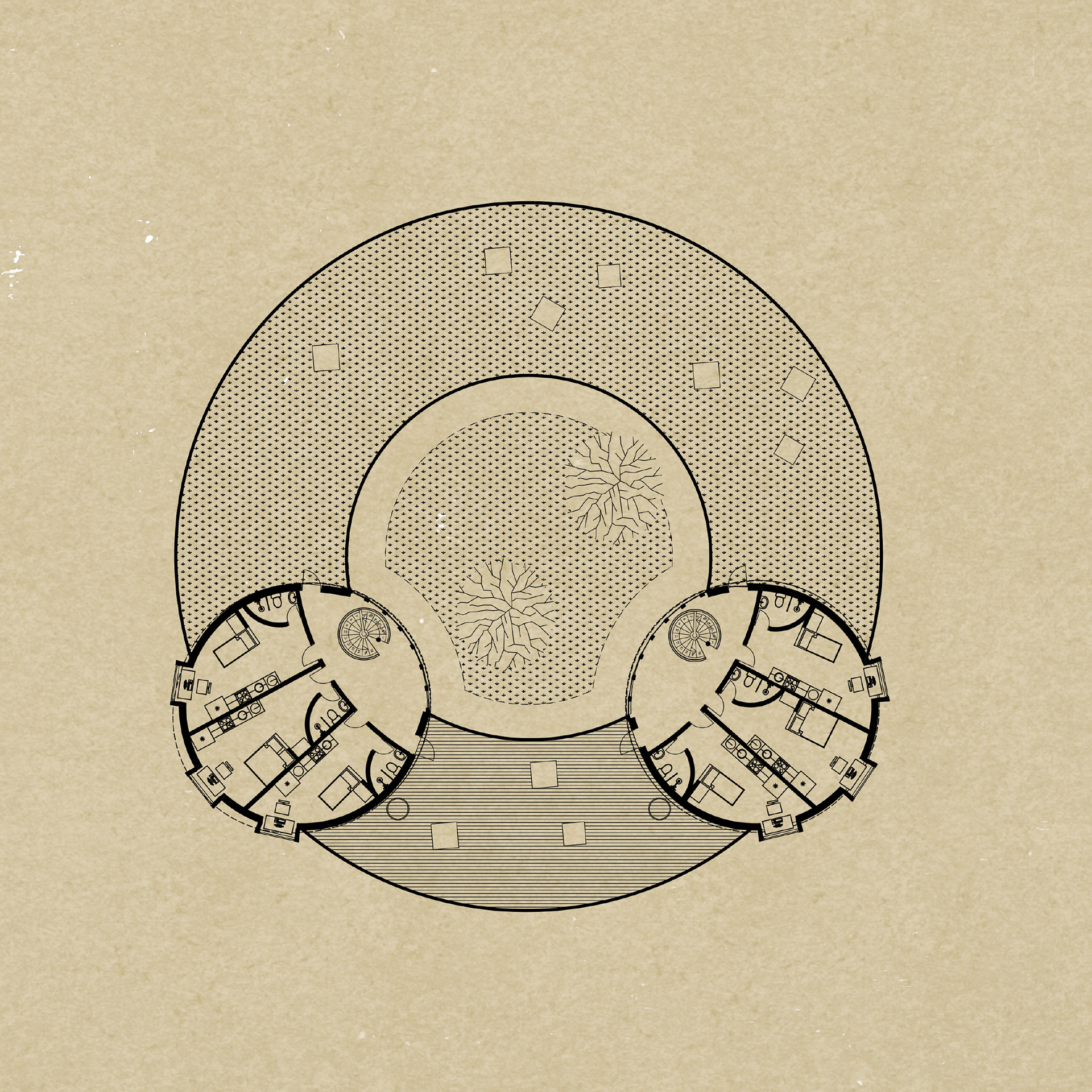
STUDENT ACCOMMODATION GROUND FLOOR PLAN
The design of the second building is slightly different, but it follows the same
circular shapes as the main building. In order to create a harmonious space for
students, an interior courtyard was integrated. Again, the building needs to
blend into the landscape, so the presence of the courtyard, glazing and plants
aims to achieve exactly that.
The entrance leads to the reception area. From here starts one circular corridor,
with entrances from both left and right side of the reception desk. This corridor
connects all the bedrooms from the ground floor.
There are also two double doors (on each side of the reception desk) that exit to
the interior courtyard.
The first floor provides, not only bedrooms, but also a spacious terrace, that faces the
sea. Just as the main building, it was designed to offer people a complete experience,
by surrounding them with nature and warm, open spaces.
sea. Just as the main building, it was designed to offer people a complete experience,
by surrounding them with nature and warm, open spaces.
STUDENT ACCOMMODATION FIRST FLOOR PLAN
The perceptions of space are continuous and dynamic, thus
natural architecture must be fluid and multi functional, as
the design of the student building aims to reflect. While
almost all architecture resumes to straight lines and squared
angles, curves have been used in design lately to soften the
building’s impact and help the structure blend in with the
surroundings.
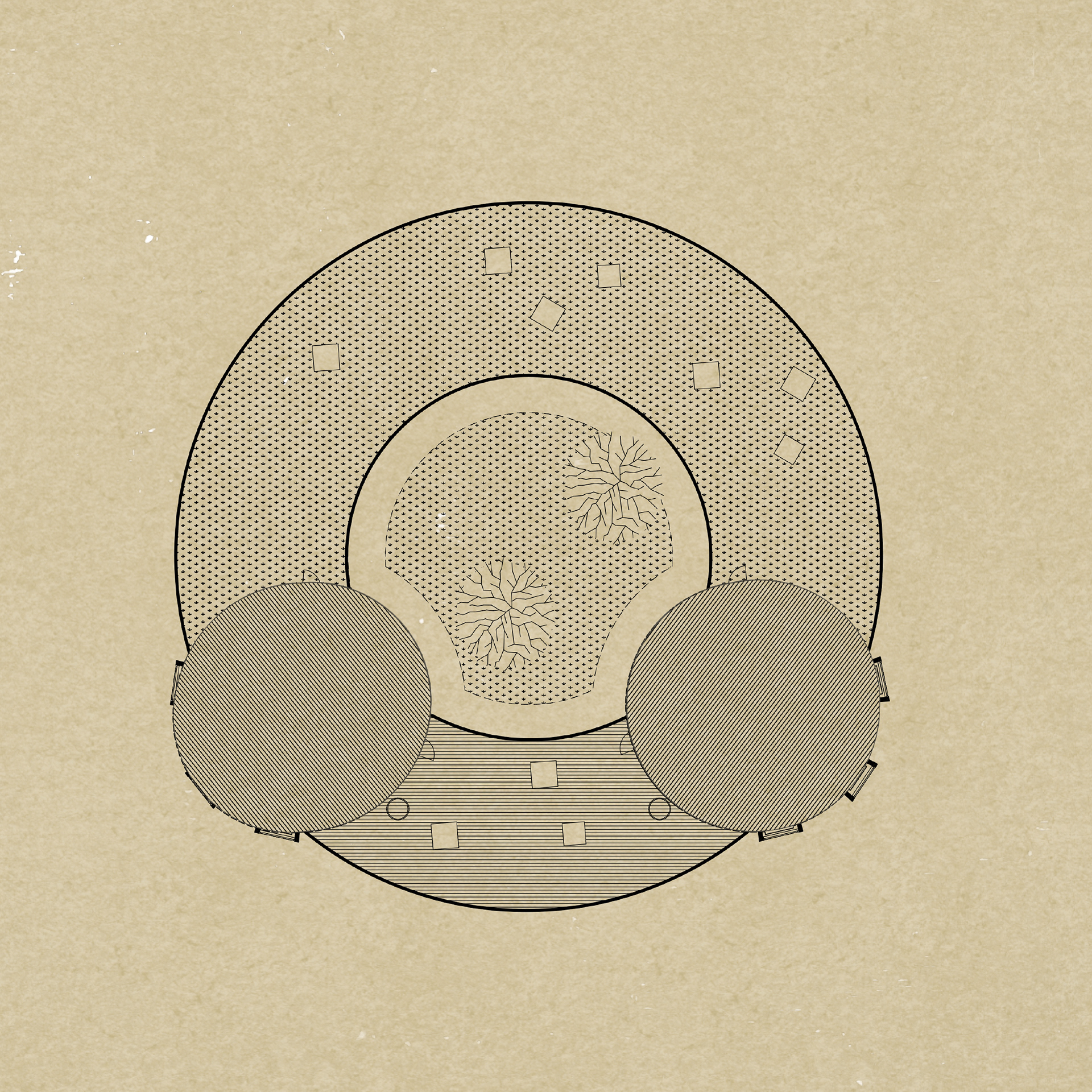
STUDENT ACCOMMODATION ROOF FLOOR PLAN
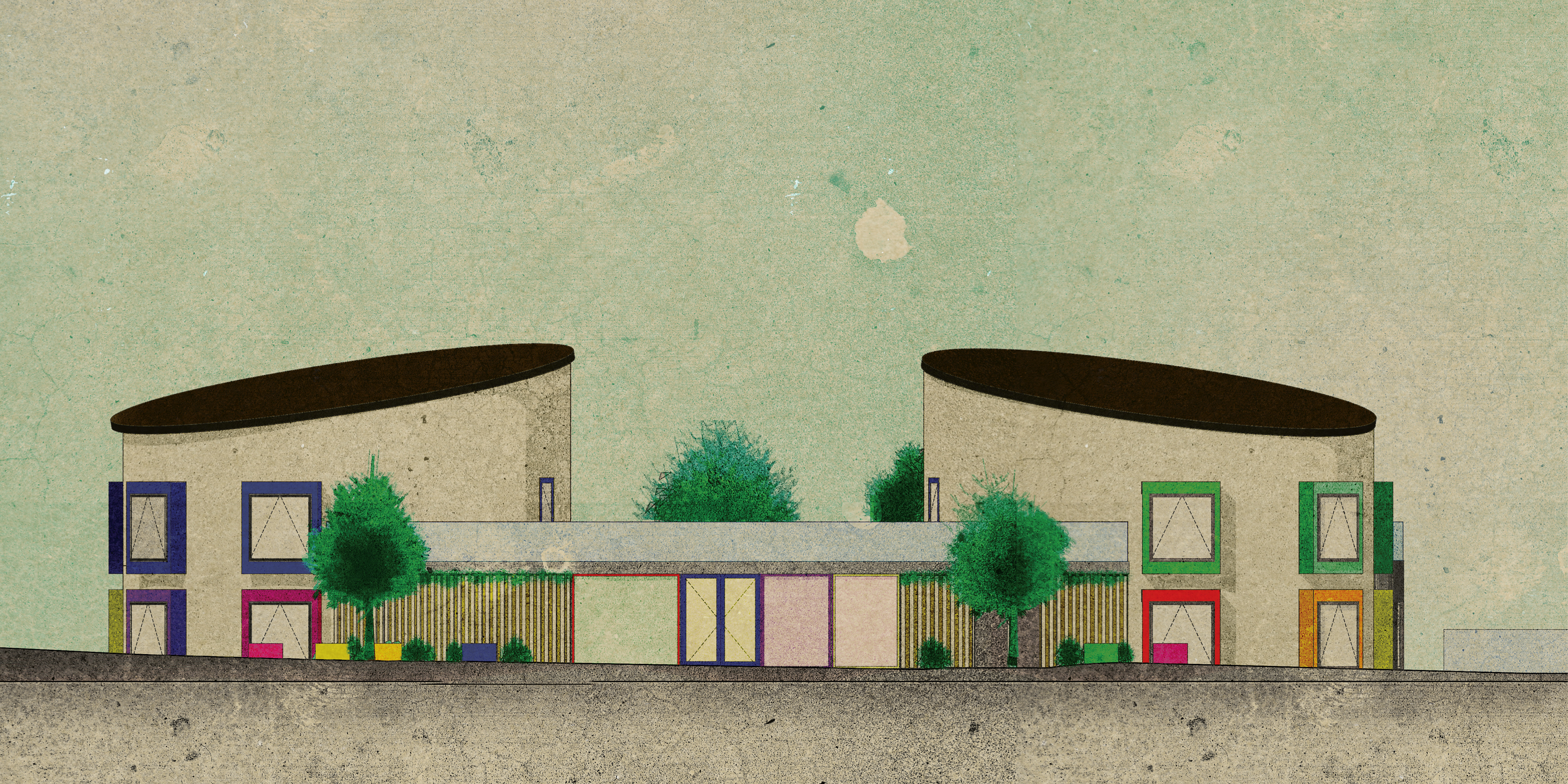
STUDENT ACCOMMODATION FRONT ELEVATION
STUDENT ACCOMMODATION REAR ELEVATION
STUDENT ACCOMMODATION SECTION
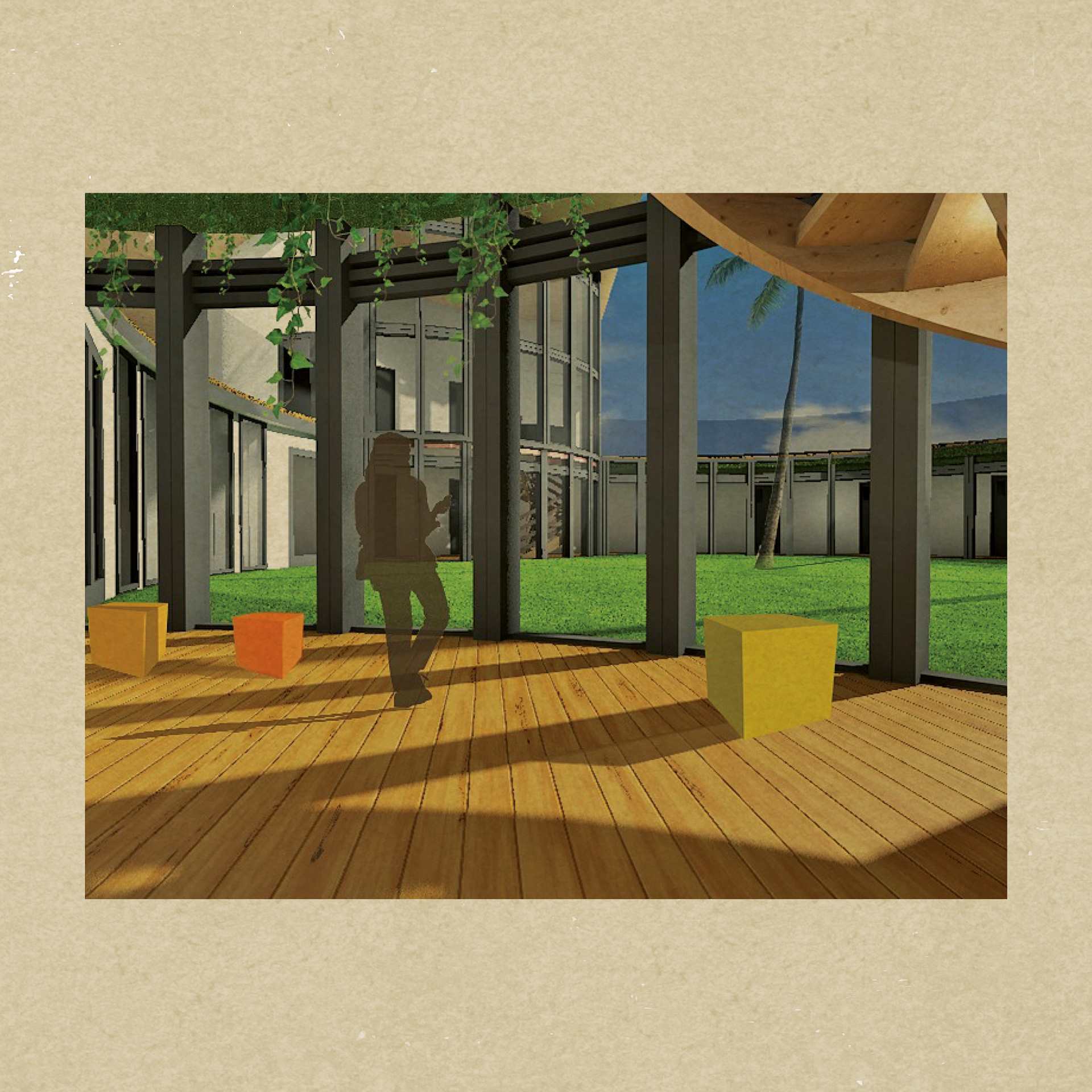
STUDENT ACCOMMODATION BUILDING HALLWAY
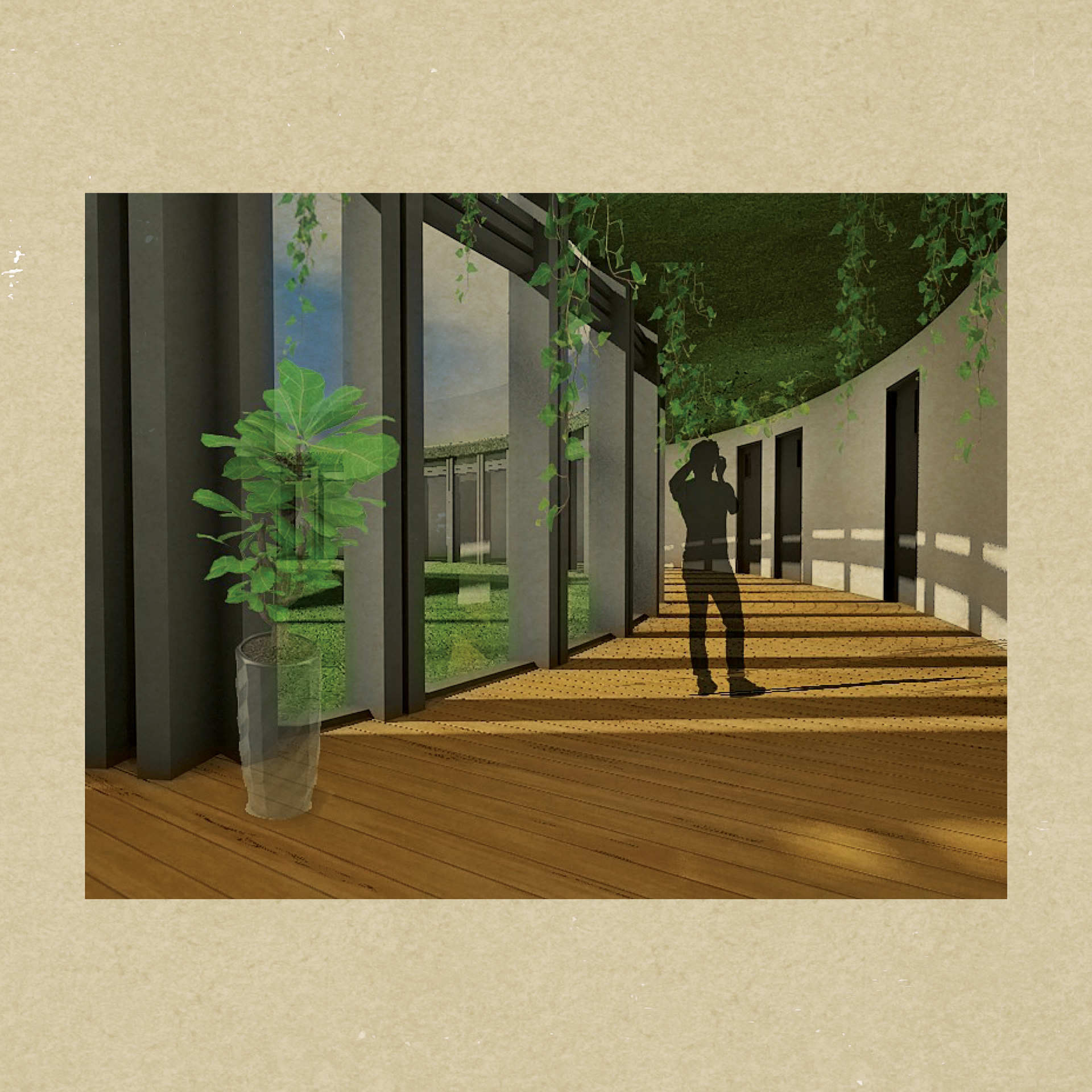
STUDENT ACCOMMODATION BUILDING HALLWAY
LIBRARY BUILDING FLOOR PLAN
The third building of the complex is the library, one of the most important spaces.
Around the study room which is located in the center of the building, there
are six large seating/reading areas (one of them designated to children), a computer
area, administration office and toilets.
Regarding the design, the main idea was to create a large open space where
people can sit, read, study and interact. There are special areas for children taken
into consideration. The design reflects the same organic influence, seen in the
other two buildings. Although it is a relatively small, single-story library building,
the organic shape aids in creating the sense of a bigger space when explored
from the inside.
The project of Media Library in France informed the design of two of the buildings
that sit on the new Community Center in Poole campus: Main Building and Library.
The flowing structure of the library and the calm, peaceful spaces that it creates combined
with the landscape and carefully chosen furniture, had a major influence on the
interior design of the two buildings specified above, as well.
LIBRARY BUILDING ROOF PLAN
Continuous and fluid, the space
can be explored through multiple
routes that offer constantly renewed
viewpoints.
Since the community center
complex is located on the seafront,
this natural element offers an
opportunity to reconnect people
with nature.
can be explored through multiple
routes that offer constantly renewed
viewpoints.
Since the community center
complex is located on the seafront,
this natural element offers an
opportunity to reconnect people
with nature.
LIBRARY BUILDING FRONT ELEVATION
Water provides a sense of calm and serenity for those who live close
to it. So, not only that people will feel more connected to nature, but
they will change their state of mind to a more peaceful feeling.
In terms of the design, a curtain wall mark the boundary between
exterior and interior. By the nature of the curtain wall (transparent),
the physical boundary is nullified within perception. It reveals the
surroundings, the sea and greenery within the complex. Having the
water element present, the entire design, had to not only highlight it,
but also take full advantage of it.
LIBRARY BUILDING REAR ELEVATION
LIBRARY BUILDING SECTION
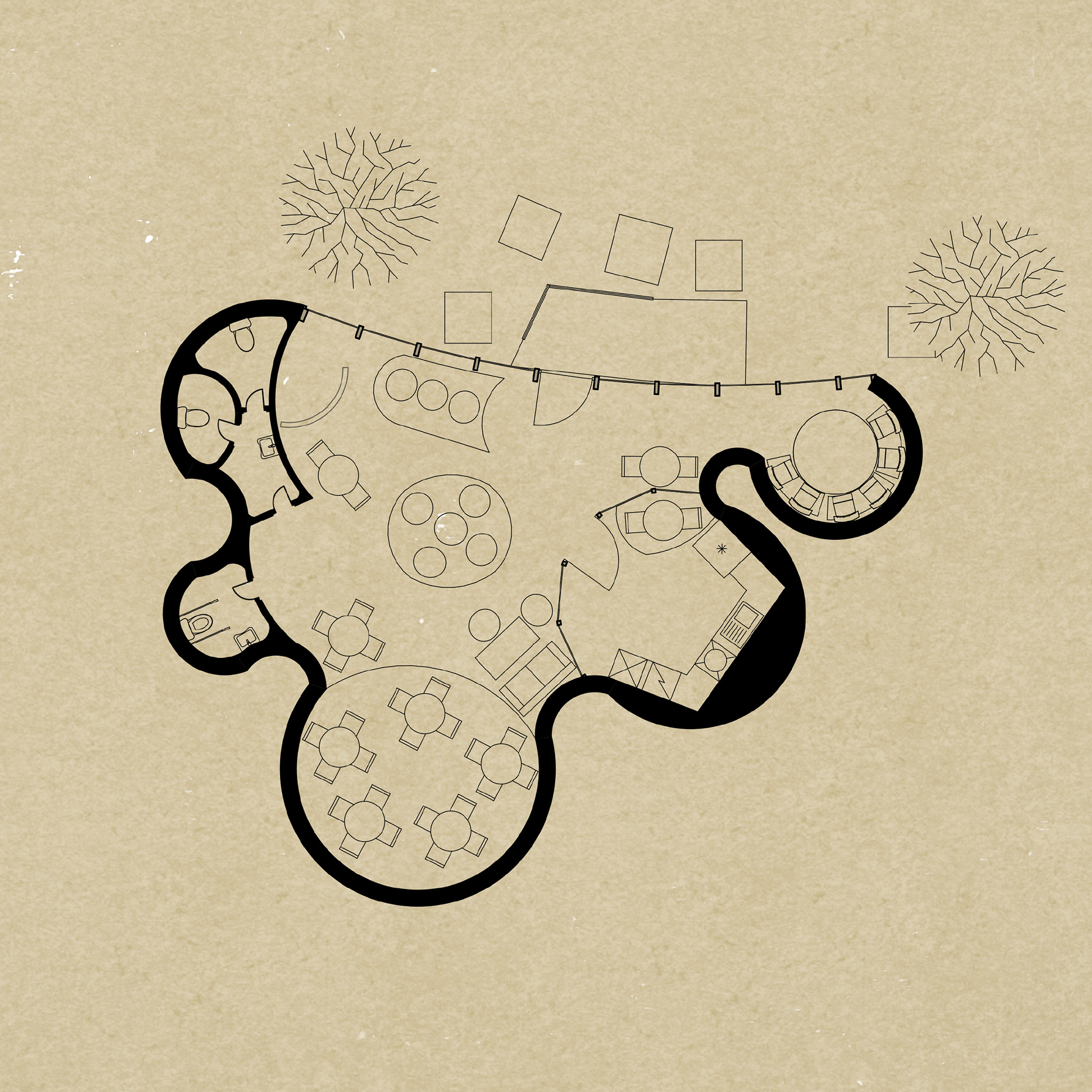
CAFE BUILDING FLOOR PLAN
The AntiCafe represents the smallest building on site. It provides seating and
studying spaces and even a small kitchen. For safety issues, there will be no gas.
A microwave and an electric oven and stove will be provided. Again, it follows
the organic continuous shape used in the previous building designs.
The Anticafe presents a newly established trend in European cities. It charges
people a small amount of money by hour and they can drink, eat, play, surf on
web, relax and work as much as they want. It offers people the space of a normal
coffee shop, where they can play hundreds of board games.
The special part of the Anticafe concept is that people will pay their stay by
hour and they do anything they want, cook, play board games, read, draw or just
relax.